Using Grids to Build Responsive Web UI
Grids don’t stop at design tools. In web development, grid systems are built into frameworks that developers use every day

Editor’s Note:
This article was originally published on Medium on June 28, 2021. I’m republishing it here on Substack for more visibility and to expand on some of the ideas that were only briefly covered in the first version. The Medium version remains live, but this updated piece is refined for new readers and today’s design conversations.
What Are Grids in Design?
According to Wikipedia, a grid is a structure (usually two-dimensional) made up of intersecting vertical, horizontal, or angular lines, used to structure content. In simpler terms, grids are the invisible frameworks that help designers arrange text, images, and other elements in a way that feels organized and easy to understand.
Think of grids as the silent backbone of visual design. They help:
Create consistency across layouts
Improve readability
Establish hierarchy in design
Add emphasis where it’s needed
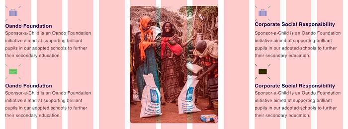
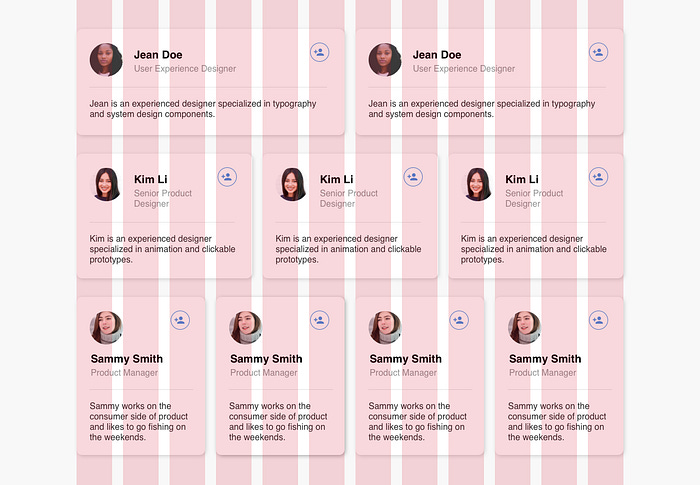
Grids are especially important in card-based products—like e-commerce stores, real estate apps, or dashboards—where content needs to be displayed in repeatable, predictable structures.
Why Designers Love Grids
Grids bring order to chaos. They’re not just “lines” on a canvas; they’re decision-making tools that guide how content flows, scales, and adapts across devices.
No matter the design software—Figma, Sketch, Adobe XD, or InVision—the grid principle is the same. For this article, I’ll use Figma as the main reference.
When building a digital product (say, a website or a dashboard), the designer divides the screen into sections: header, hero area, cards, newsletter, footer, etc. If you design only for a single screen size, things break easily when viewed elsewhere. But when you design with grids, your structure adapts smoothly across desktop, tablet, and mobile. That’s the foundation of responsive design.
Grids and the Rule of Thirds
A good way to understand grids is through photography’s Rule of Thirds. It states that an image should be divided into nine equal parts with two vertical and two horizontal lines. The most important visual elements should be placed along these lines or at their intersections.
This creates balance, energy, and visual interest. Similarly, grids in UI design distribute content and elements in a way that feels balanced to the human eye. The goal is not just prettiness—it’s clarity and flow.
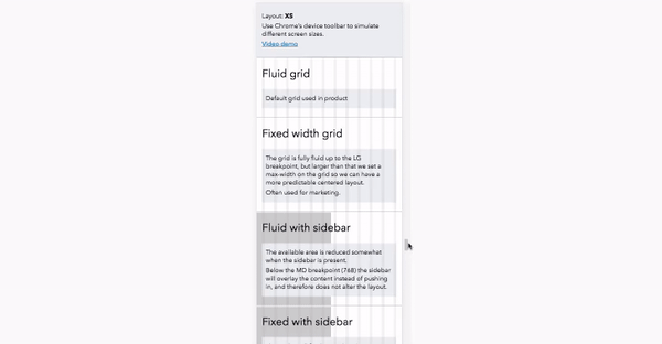
Responsive Grids: Making Designs Fluid
A responsive grid system (sometimes called a fluid grid system) is what ensures your designs look good on any screen size.
In Figma, you can customize grids depending on:
The type of elements you’re working with
The amount of whitespace you want
The text hierarchy
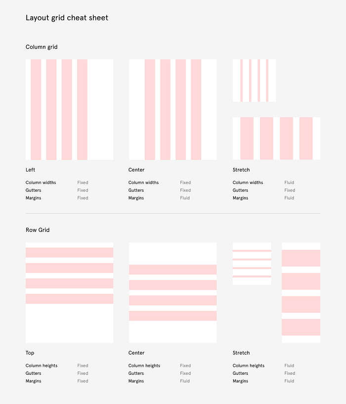
Gutters and Margins
Gutters: the spaces between grid columns (commonly ~20px). They prevent content from looking squeezed.
Margins: the outermost spaces on each side of your layout. These keep designs breathable and avoid edge-to-edge clutter.
Most web layouts use vertical grids because they align with how websites scale across screens. Horizontal and uniform grids exist too, but vertical grids are the backbone of responsive UI.
Grids in Practice
Web vs Mobile
Web: Websites use wider grids with multiple columns (e.g., 12-column systems). These make it easier to place content and rearrange it across breakpoints.
Mobile: Mobile designs typically use fewer columns with narrower widths, because the screen real estate is already divided into familiar sections (status bar, nav, etc.).

Rulers vs Grids in Figma
Rulers are flexible guides you can move manually.
Grids auto-divide the frame into fixed columns/rows for consistent alignment.

Wireframing with Grids
At the wireframe stage, divide each page into blocks of content—images, text, forms, etc.—and assign them to grid columns. Later, when the design is resized for mobile, these blocks rearrange automatically, stacking vertically if needed.
This ensures that even when layouts shift, hierarchy and structure remain intact.
Bridging Design and Code
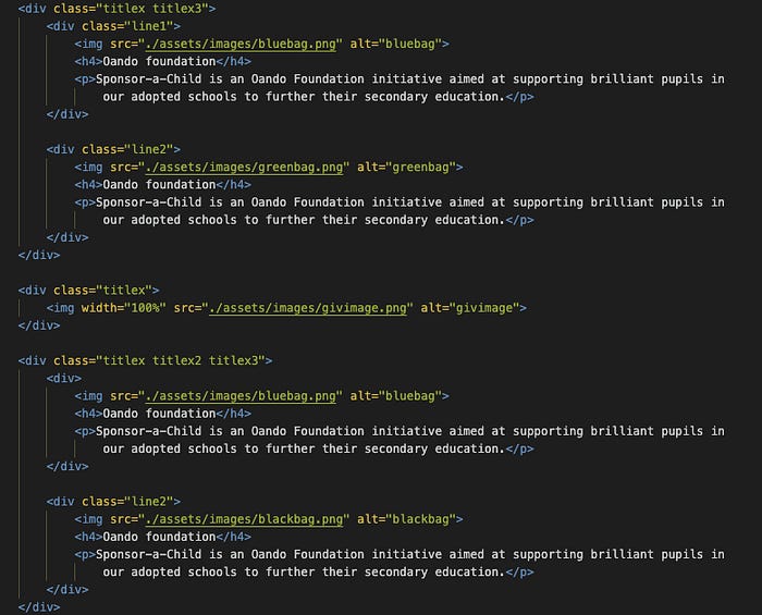
Here’s where grids become more than just visuals—they guide development.
When you hand off designs to developers, grids provide a clear mapping to HTML/CSS. For example:
Parent div blocks represent the main grid columns.
Child elements inside those divs can stretch into gutters if needed, but as long as the parent stays aligned, responsiveness is preserved.
This creates a shared language between designer and engineer. The developer knows how to structure the code because the grid already defines how elements should behave across screen sizes.
Popular Grid Systems
Grids don’t stop at design tools. In web development, grid systems are built into frameworks that developers use every day:
1.
Bootstrap (12-Column Grid)
Bootstrap popularized the responsive 12-column grid system. Designers and developers can place elements into columns (e.g., 3/12, 6/12, etc.), which automatically stack on smaller screens. This system is still widely used because of its simplicity and predictability.
2.
CSS Grid
Unlike older frameworks, CSS Grid is a native web technology. It allows developers to define rows and columns directly in CSS, making it incredibly powerful and flexible. Designers working with Figma grids will find a direct parallel in CSS Grid since both use columns, rows, and gutters as their foundation.
3.
Flexbox
Flexbox isn’t a grid system per se, but it’s often used alongside or instead of grids for simpler layouts. It’s great for one-dimensional alignment (horizontal or vertical), but not as strong for full-page grid structures.
4.
Tailwind CSS
Tailwind combines utility classes with a grid system, giving developers fine-grained control while still following a responsive column structure. For example, grid-cols-12 in Tailwind directly maps to a 12-column layout, making it easy to replicate designs from Figma.
5.
Material Design Grid
Google’s Material Design also uses a grid system as its foundation. It standardizes spacing, margins, and breakpoints for Android and web applications, making it especially useful for large-scale systems.
Breaking the Grid (The Right Way)
Not every element must always sit perfectly inside the grid. Hero images, background illustrations, or bold typographic treatments often spill past columns and margins. This is not bad practice—as long as the exceptions are intentional and applied consistently.
For example, a large hero image stretching edge-to-edge across the screen can create drama while still maintaining grid-based consistency for the rest of the layout.

Why Grids Matter for Responsive UI
Responsive design isn’t just about resizing content. It’s about maintaining balance, usability, and aesthetics across every device—from widescreen monitors to smartphones and even wearables.
Grids are the secret ingredient that make this possible. They:
Align content logically
Simplify collaboration between designers and developers
Future-proof designs against new screen sizes and orientations
When used thoughtfully, grids aren’t restrictions—they’re frameworks for freedom.
Final Thoughts
Grids might feel invisible to end users, but they are foundational to great digital experiences. They bring structure, harmony, and predictability to layouts while keeping designs flexible enough for the unpredictable range of devices people use today.
So whether you’re designing a landing page, a mobile app, or a smartwatch interface—make grids your ally. They will save you from chaos and help your designs feel balanced, modern, and effortlessly responsive.
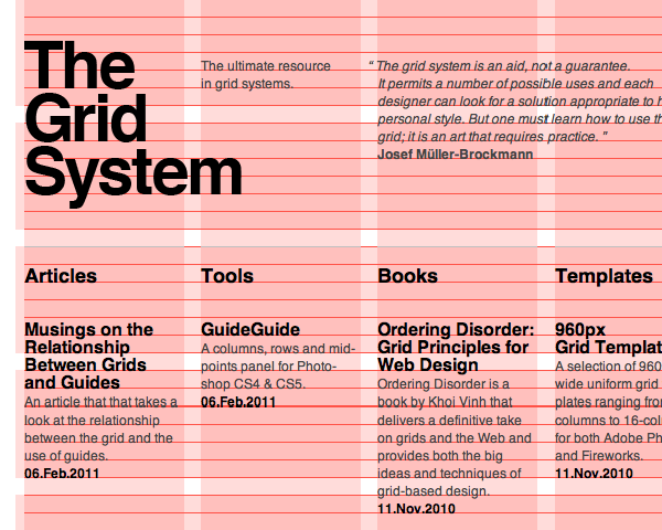
Here’s what all the yakety-yak been about 😃.